Consistency is often misunderstood as making every screen look the same. Apple’s 2026 design guidance presents a more useful definition: interfaces should preserve recognizable behaviour and visual relationships while adapting to different devices, sizes and contexts. The latest platform refinements focus on readability, personalization and layouts that can move more naturally across iPhone, iPad, Mac, Apple Watch and spatial experiences.
This matters because platform boundaries are becoming less fixed. An iPhone application may appear through mirroring on a Mac, an iPad window may be resized, and content may move between touch, pointer, voice and spatial interaction. A rigid layout cannot handle that range. Consistency has to come from principles, components and behaviour rather than from one set of dimensions.
Familiarity creates usable flexibility
Apple’s design-principles session identifies familiarity as one ingredient of good design, alongside purpose, agency, responsibility, flexibility, simplicity, craft and delight. Familiarity does not prohibit invention. It gives people a stable base from which to understand what changed. Standard controls, recognizable hierarchy and predictable navigation reduce the amount of attention an interface demands before someone can act.
That foundation becomes more important as layouts become fluid. If controls move when a window changes size, their meaning and behaviour should remain recognizable. If an application adopts a new visual material, text contrast and control boundaries still need to be clear. Familiar patterns make adaptation feel intentional rather than unstable.
Readability is a system property
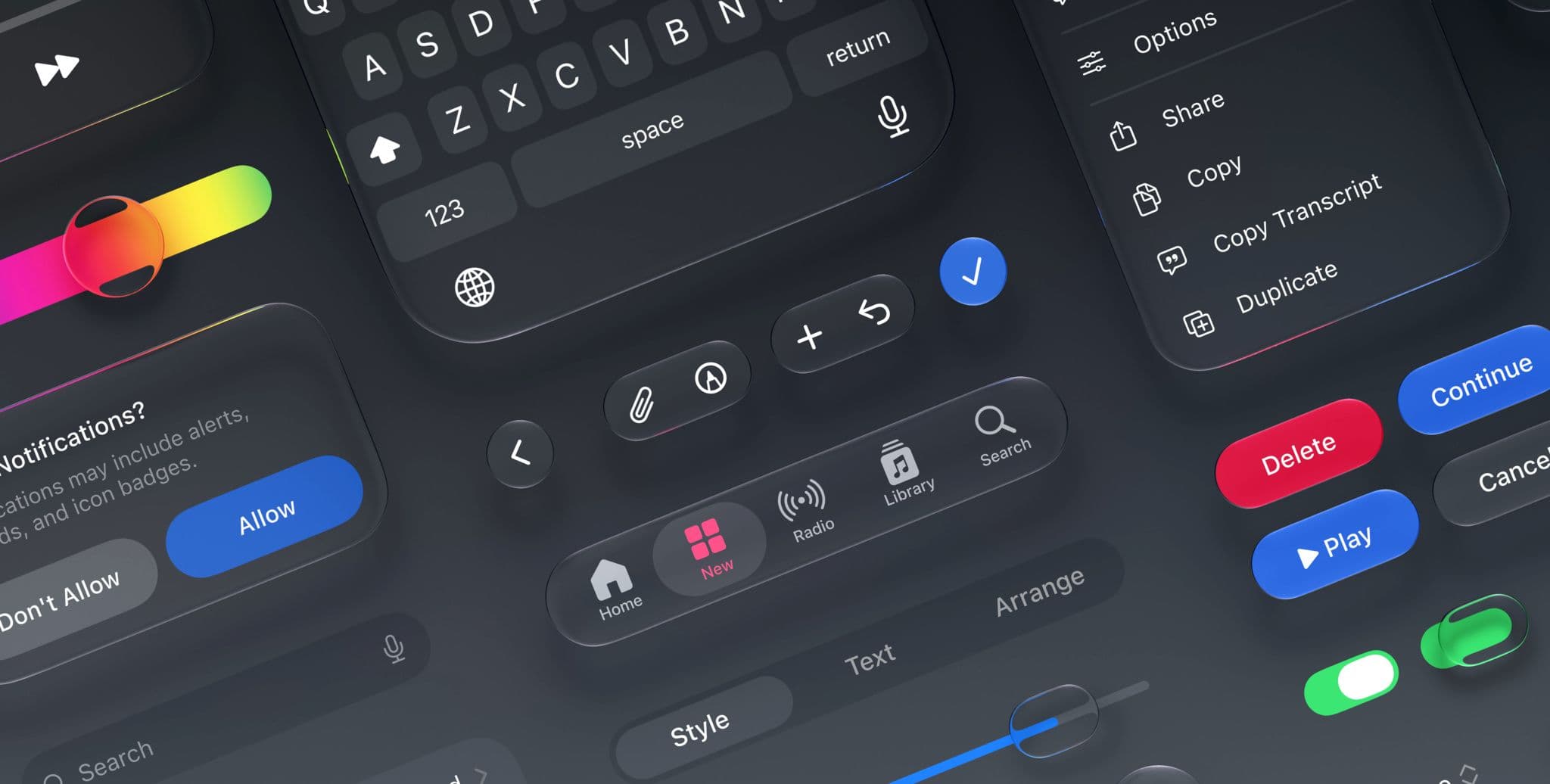
Apple’s 2026 refinements to Liquid Glass emphasize improved consistency and readability. Readability is not only a typographic choice. It depends on contrast, layering, motion, background content and whether controls remain distinguishable in different appearances. A translucent material can create depth, but it must not make the interface harder to parse when content behind it changes.
The updated design kits are important because they turn guidance into reusable components and states. They include expanded support, naming that aligns more closely with code, improved resizing and dark-mode resources. A design system is more dependable when its design assets and implementation language describe the same concepts. Shared naming reduces translation errors between design and engineering.
Agency is more than offering options
Agency means people understand what they can do, what will happen and how to recover. It is weakened by ambiguous automation, hidden consequences and interfaces that make important decisions on a user’s behalf. As Apple integrates more intelligence into its platforms, the principle becomes especially relevant. Suggestions should remain suggestions, destructive actions need confirmation and generated outcomes should be reviewable.
Good personalization also depends on agency. Allowing someone to resize, rearrange or choose an appearance is useful only when the system remains coherent afterward. Flexible interfaces need boundaries that preserve hierarchy and accessibility. The goal is not unlimited customization; it is meaningful control without forcing every person to become the designer of the product they are trying to use.
Simplicity requires difficult editing
Apple describes design as making something with intention and reminds designers that every feature asks for time, attention and trust. That shifts simplicity away from visual minimalism. A sparse interface can still be confusing, while a dense professional tool can be clear if it exposes the right structure. Simplicity comes from deciding what belongs, grouping related actions and making the next step understandable.
This is an editorial task as much as a visual one. Labels need to communicate outcomes, not internal architecture. Search needs to reflect the way people describe what they want. Empty states should explain how to begin. Removing an unnecessary feature can improve a product more than polishing its icon because it reduces the number of decisions every user must process.
Consistency should support the content
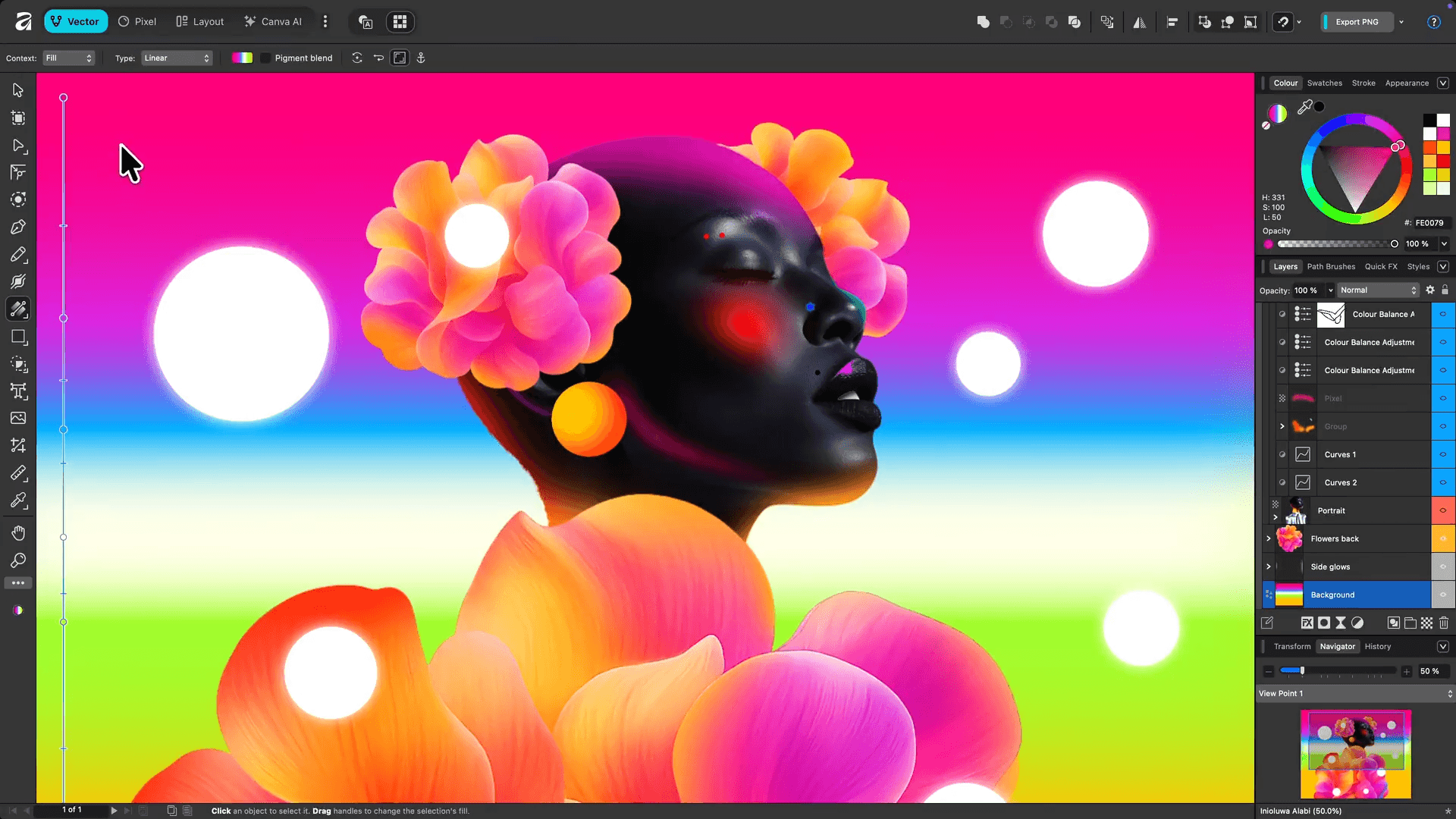
A unified platform language is most successful when it recedes behind the work people came to do. Shared materials and controls can create coherence, but an application still needs an identity appropriate to its purpose. A health tool, a drawing application and a transit app should not communicate with the same emotional tone merely because they use the same component library.
The durable lesson from Apple’s 2026 guidance is that consistency is not sameness. It is a promise that the interface will behave in understandable ways as context changes. Designers can then spend their creative effort on the moments that genuinely benefit from distinction. When familiarity, readability and agency are dependable, delight does not need to be added as decoration. It can emerge from an experience that feels considered from one device to the next.
What to watch next
For product teams outside Apple, the lesson is not to imitate every surface treatment. It is to examine whether navigation, controls, typography, motion and accessibility communicate the same hierarchy across the whole product. A consistent system should still allow a reading app, finance tool and creative editor to express different priorities. The test is whether variation supports the task or merely reflects which team built the screen. Apple’s own refinements also show why design systems require governance after launch: real content exposes contrast problems, new devices change spatial assumptions and repeated controls reveal where ornament competes with clarity. Teams also need regular testing with real users, devices and accessibility settings before visual conventions harden into technical debt. Consistency is therefore not a one-time visual cleanup. It is the ongoing work of preserving understandable relationships while platforms, capabilities and user expectations continue to change.